INFO
This article was auto-translated using ChatGPT.
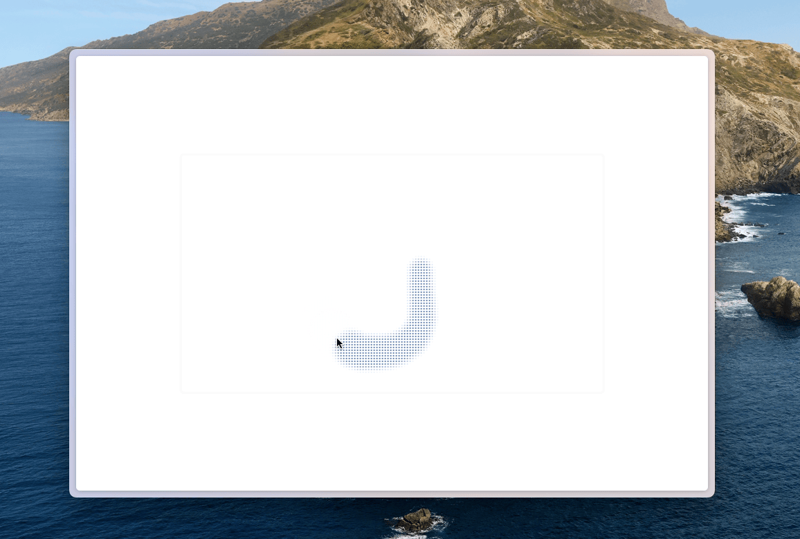
I've seen an interesting component in many places. When there's nothing underneath, this component looks like a solid-colored panel. But once something passes underneath it, the true nature of the panel is revealed — small holes appear at the corresponding positions, showing the color of the object moving behind it.
After inspecting these components on various pages, we can see that the core implementation relies mainly on the following CSS:
backdrop-filter: saturate(50%) blur(4px);
background-image: radial-gradient(transparent 1px, #fff 1px);
background-size: 4px 4px;
backdrop-filter creates a blurred background effect, allowing colors beneath the panel to spread softly and giving the visible colors inside the small holes a richer appearance. background-image creates the dotted hole pattern on the div. transparent defines each hole so that the color beneath can pass through, while #fff represents the base color of the panel. background-size defines the size of each hole unit and tiles it across the entire panel.
Here is the full code:
<template>
  <div class="w-screen h-screen overflow-hidden">
    <div
      class="top-1/2 left-1/2 -translate-x-[50%] -translate-y-[50%] w-2/3 border-gray-50
             rounded-md border-3 border-solid shadow-black fixed z-20 bg-img-dot aspect-video"
    />
    <div
      class="rounded-full -translate-x-[50%] -translate-y-[50%] bg-blue-500 fixed z-10"
      v-for="(item, index) of moveList"
      :style="{
        top: `${item[1]}px`,
        left: `${item[0]}px`,
        width: `${50 - index}px`,
        height: `${50 - index}px`,
      }"
    ></div>
  </div>
</template>

<script setup>
import { useMouse } from "@vueuse/core";
import { ref, watch } from "vue";

const moveList = ref([]);

const { x, y } = useMouse();

watch([x, y], (newValue) => {
  moveList.value = [newValue, ...moveList.value].slice(0, 20);
});
</script>

<style scoped>
.bg-img-dot {
  backdrop-filter: saturate(50%) blur(4px);
  background-image: radial-gradient(transparent 1px, #fff 1px);
  background-size: 4px 4px;
}
</style>
Check out the source code, and try the demo.